
If you are a small business today, it is crucial to have a website that helps you reach your goals. There are websites that are purely informational and others that try to make you buy/do something. The internet opens a world of opportunities for business. It gives credibility to your business, a way to contact you, and a way to make a good first impression for potential consumers. As time progresses and your business generates a consistent flow of active users, it’s going to be important that your image remains in good standing and helps you build your client base. Just having a website will not get you far and can be very hard to maintain, but here are some common mistakes everyone goes through that you and your business can avoid!
Too Much of Everything

Why it’s bad:
There are definitely times when TOO MUCH can be a bad thing. Having information readily available in an organized manner is a lot better than having all of your information displayed at once, and praying that whomever comes along your website will actually understand what you’re trying to do. For example, it’s like having your appetizer, entree, and dessert all mashed together in one plate versus having each course separately. It’s cluttered, unprofessional, and will definitely confuse your customer before they make it to any other page.
Solution:
- Organize information
Organize information into relevant pages and be sure to separate sections into different pages. If you are selling clothing, there’s going to be a page for men, women, and kids. If you’re a web design company, you can have an “About Us” page that goes over your history. On another page, a customer can look at your previous work under a “Portfolio” page.
- Use “whitespace”
White space is literally what it sounds like. White, blank, empty spaces on your website that allows your viewer to distinguish visually what is important and helps keep clutter down.
Text. Text. And … More Text

Why it’s bad:
This issue usually shows up in many creative ways. Sometimes, a designer might try to make the text look cool so they’ll use a lot of different fonts. While totally cool looking, it’s often confusing to readers. Not having any differentiation in text is just as bad, like having just text on a page. JUST. TEXT. As mentioned in the previous mistake, an overwhelming amount of information at once is not good especially when it’s not interesting. When it’s just text, it makes your website similar to watching paint dry. That’s fine if you’re into it, we don’t judge, but the majority of people would say otherwise.
Solution:
- Simplify your writing
You don’t have to go in such fine detail explaining your business on main pages like the homepage - do that on a page specifically for that topic. The trend is that attention spans are getting shorter and shorter so people will bounce from your website if it requires more than a minute for them to read. Keep it short, simple, and straight to the point. Using bullet points and headers to organize your text in a fluid way helps as well.
- Reduce your fonts
Using fonts isn’t the problem. Using TOO MANY fonts is the problem. Try to just keep it at a max three fonts for headers or titles that will catch their attention. Good quality content will keep them interested in reading more, not the font that you are using.
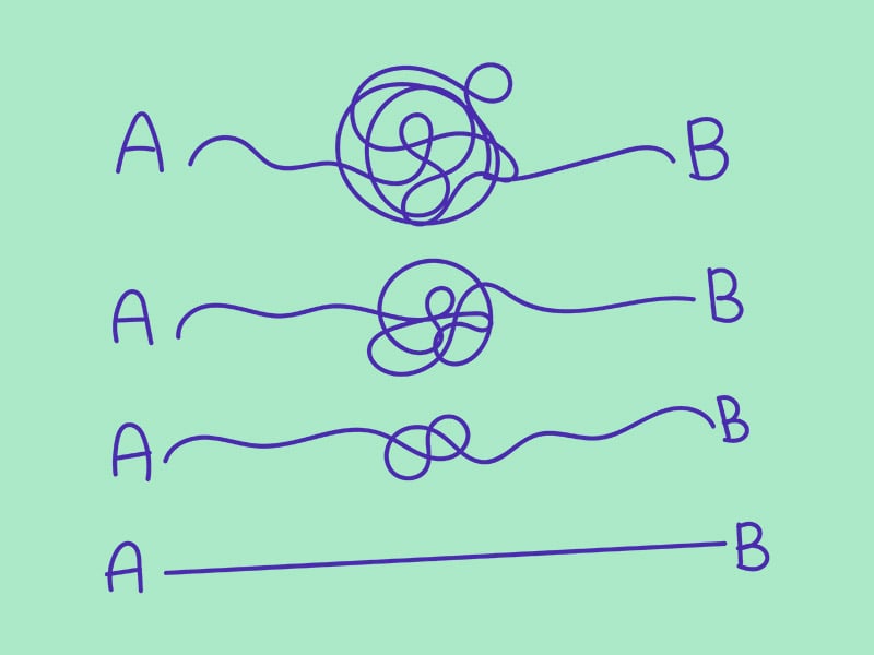
From Point A to Point L
Why it’s bad:
People will get lost if you do not direct them in an easy manner. Keep in mind how fluid and connected everything has to be on your website. You can have the coolest fonts, pictures, or videos that will attract any demographic, but if they can’t get to the pages they want to, then the appeal is pointless. Those people you attract will leave the website if navigation through various pages is too difficult or confusing to find under many menus and options. Imagine the route a GPS gives you to navigate anywhere. The point of having a GPS is to give you the best possible route that will get you to where you want in the easiest and quickest ways. They will not send you through alleyways or detours that will have you doubting the GPS. This is for any page as well. Each page has to be accessible like the home page if someone were to venture through the “Contact Us” page.
Solution:
- Use “whitespace”
Whitespace, as mentioned before, makes everything on your screen more minimal. Use it like road lines to keep a viewer’s attention focused on certain parts of the website and not veer off to unnecessary parts.
- Noticeable links
Try to emphasize links especially when it’s in text. Text that have some sort of underline or is colored text to be hyperlinks to various parts of your website or somewhere else. It can sometimes be skimmed through because of how miniscule the difference is compared to regular text. Bolding the text or even creating a separate border for the link to stand out will catch a viewer’s attention.
- Working links
If your links are already noticeable just make sure that the link redirects them to the proper page you want the viewer to go to. Double check that they are correct. You wouldn’t want them to be redirected to the “Storm Area 51” Facebook page, would you? You want the viewer to storm various parts of your website instead. And make sure the links work and are updated! Some links and pages do not work and are listed as 404 errors. It just means that the pages are not reachable and should be fixed.
“So … Now what?”
Why it’s bad:
You should have an end goal for people who come to your website. For retailers, you want them to make a purchase. Hotels and restaurants would want you to make reservations for a room or table. On our website, we want people to call or fill out our contact form. In order to get to those final actions, a consumer needs clear access to it. All of the previous mistakes, when fixed and done correctly, will lead a consumer to this. That’s why having clear, concise, but appealing website is important.
Solution:
- Create a “call to action”
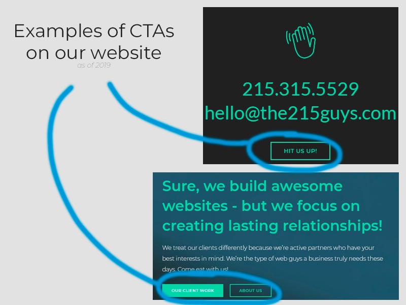
A “call to action” is something on your website that gets a visitor to do something you want them to. This should be the easiest part of the website if everything previously mentioned has been done correctly. It should already be obvious what you want them to do. If you want to make a sale, make sure there are links to your products pages. Do the same for any other service provided such as booking a hotel, making reservations, etc. Make sure it is easily accessible on every page so a consumer can instantly do what you want them to without having to go to another page for it. This doesn’t even have to be a sale, but even signing up for an emailing list is just as important. This is still beneficial to you and your website because you have someone interested in your content.
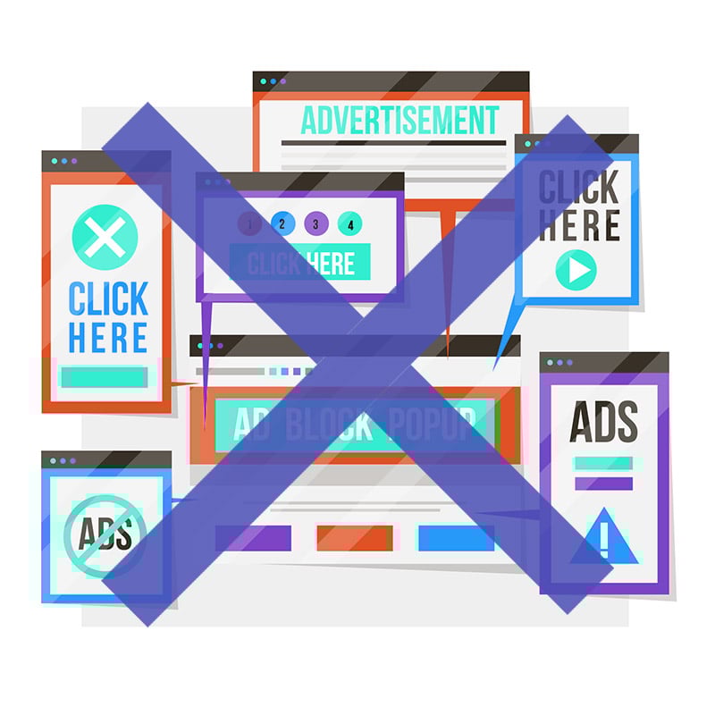
Pop Ups/Ads
Why it’s bad:
These are just annoying and can push your consumers away from your website. There is nothing wrong with some ads running on the side of your website, but too many can just add more clutter. Ads that specifically show up on the screen and have to click outside of it to ignore it are probably the worst. Those ads, or the ones that open and redirect you on a new window without having to click on anything are the worst. It disrupts the fluidity of information you are trying to convey to your viewer. Some viewers can be so annoyed that they just leave your website completely because of it, even if everything about your website is amazing.
Solution:
- Limit or make discrete ads
It’s okay to have ads, but make sure it’s not too loud and obnoxious. Having ads that just run on the borders of your website are enough. A pop-up or two that is right before they perform a call to action would be good to give the viewer more incentive to sign up or make the purchase. For example, for new viewers on a retailer, they could offer free shipping if they sign up for the emailing list.
Websites are crucial for any business. The Internet has made information so easily accessible and in order to fully function as a business, it is mandatory to have a website. Consumers are always looking for new things to try on websites, but those sites must be credible and appealing. As mentioned, too much text or media can cause a lot of problems. It can create a lot of clutter and confusion that will make the viewer leave before even getting the chance to open another page on the site. You want to avoid all of these mistakes so you can build a clear path for a new person to open your website, be interested, find information, and finalize a decision to make a sale or not for your business.