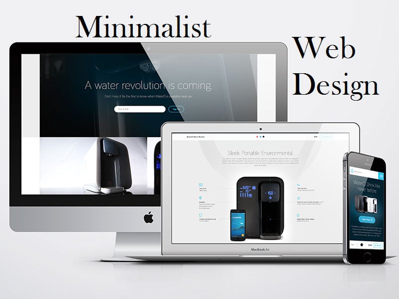
5 Essentials Of Minimalist Web Design
For some years, minimalism has been a favorite web design style for many users and us! Among its many benefits include faster loading, utilizes fewer server resources and is typically faster to develop. Furthermore, the visual impression given by the style is that of a clean, professional look.
The minimalist web interface is often credited to Google, and the success story of the Google search page was what paved way for minimalism.
Minimalism –This is a way in which unnecessary elements in a web design are removed leaving the design functional and clean. However, the minimalist web design can be a complex task to master. For instance, usability in the website must be provided even though only fewer things are available to work with. Therefore, to get a grasp of minimalism, the person should learn the basics of minimalist site design.
Flat interface
Flat interface is a fundamental component of the minimalist design. In it, shadows, highlights, and gradients, 3D features or textures are not available. Just like minimalism, the flat interface removes unwanted material leaving only the important ones, thereby creating an intense and straightforward user experience.
Limited use of color
Color is crucial in the minimalist web design. Since there are only a few elements in the design, the use of color is very critical as it will take most of the attention. By using color, a particular area in the design can be brought into focus or an area of visual interest can be created.
The color scheme in most minimalistic design is monochromatic (gray, black and white shades). In the design, the monochromatic color range together where one or two bold colors is used to show or highlight the key aspects of the website. Nonetheless, the person should always stick to the color scheme that is complementary or family colors only.
Negative space
This is a significant component in the minimalist web design that was made famous by Google. It is also known as white space, implying that significant gaps of screen space are left empty. Contrary to the utilization of screen space by designers, minimalism uses the empty space to ensure that users shift their focus to a particular element on the site, be it a logo, call to action or graphics.
Simple navigation
Navigation in the minimalist web design is simply compared to the drop-down menu. It is in the form of horizontal navigation menu or the hamburger menu. The latter is occasionally used as it can make navigation items less clear. A simple navigation menu in the minimalist design will enable website users to find links and carry out site activities with ease.
Dramatic typography
Since the number of elements in a minimalist website is few, a typeface can dictate the atmosphere and identity of the web design. It can replace graphics and photos when used properly and further create an attractive visual impression.
Nonetheless, when determining text hierarchy, size of the font, variations in weight and style should be considered. It’s important to note that the use of bold typography will be relevant only when delivering a significant message meaning; they should know the distinction between distraction typography and purposely bold typography.
Conclusion
The primary objective of the minimalist web design is to accentuate the content and not just leaving blank spaces. It is all about getting rid of the distraction to allow website visitors to concentrate only on the relevant materials. Lastly, an excellent minimalist web design will be that which finds a balance when conveying a message in a site while at the same time utilizing the simplest of designs.