Did you know you can set elements in a container to always be the same height? I didn’t. It was revolutionary when I found out that CSS could do this. Previously, I had used javascript to find the tallest item and then set the height of all of them to that box. No more!
If you missed it, check out the intro to flexbox here where I talk about how cool and easy flexbox is. And this article will go into one of the coolest features that blew my mind.
This will be useful for any time you want a grid of items to be the same height. We find this happening a lot with blog grids or portfolio grids where text might be different lengths per item. It looks funky when some boxes are different heights than others, just check out the example:
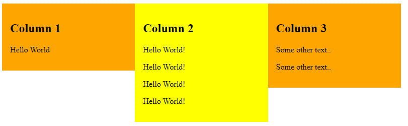
In the past, like I mentioned, there were hacky ways to solve this. You could use javascript to find the tallest one and set the height of the others to match. Or, you could define a maximum height and hide anything over that. Or, you could set a max number of characters. None of those are as simple as flexbox’s solutions. Here’s what it can do to the above example:
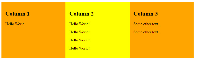
It doesn’t matter what’s in the columns or boxes and it doesn’t matter how much - it just sets the items to be the same height with a line of code you’re already adding to use flexbox: display: flex;
Here’s the code I used to get this working
The HTML
<div class="col-container">
  <div class="col" style="background:orange">
    <h2>Column 1</h2>
    <p>Hello World</p>
  </div>

  <div class="col" style="background:yellow">
    <h2>Column 2</h2>
    <p>Hello World!</p>
    <p>Hello World!</p>
    <p>Hello World!</p>
    <p>Hello World!</p>
  </div>

  <div class="col" style="background:orange">
    <h2>Column 3</h2>
    <p>Some other text..</p>
    <p>Some other text..</p>
  </div>
</div>
The CSS
.col-container {
  display: flex; /* this is all you need to get an equal height grid */
}
.col {
  padding: 16px;
  width: 25%;
}